The Pigments That Shaped Art History
Behind the masterpieces of art history lies an untold story written in the very materials of their creation. From the Prussian blue that unites Hokusai and Picasso to the intense red of a Vermeer, pigments reveal secrets, scientific breakthroughs, and unexpected events. The palettes of the great painters often included perilous substances, such as the arsenic in a green used by Berthe Morisot or the toxic lead in a white favoured by Whistler. These histories of material culture, filled with ingenuity and danger, change the way we see some of the world's most famous paintings.
The colour in a painting is never merely an aesthetic choice. Behind the hues that compose some of the most recognisable works of art lie stories of scientific discovery, accidental experiments, and even mortal danger. As art historian Kelly Grovier, author of the book ‘The Art of Colour’, observes, the history of each pigment profoundly affects our perception of a work, reminding us that ‘colour is never what it seems’. From the palettes of the Old Masters to the industrial production of the 19th century, the material dimension of painting reveals an entire cultural journey.
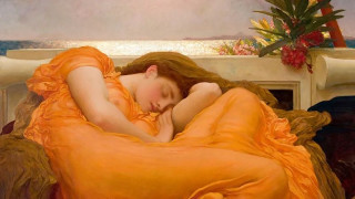
The history of art is filled with such chromatic narratives. One of the most distinctive is that of Prussian blue, a pigment that unexpectedly links Katsushika Hokusai’s ‘The Great Wave off Kanagawa’ with Pablo Picasso’s ‘The Blue Room’. This colour was born by chance in Berlin in 1706, when the alchemist Johann Konrad Dippel failed in his attempt to create a medicinal elixir. The result was a deep, stable blue that conquered Europe. Similarly, the dazzling orange in the dress of Sir Frederic Leighton’s ‘Flaming June’ (1895) owes its existence to the 19th-century discovery of chromite deposits, which made Chrome Orange widely available.
The artist’s palette, however, also had its dark side. In John Singer Sargent’s enigmatic portrait ‘Madame X’ (1883-4), the subject’s unearthly pale complexion was achieved in part with ‘bone black’, a pigment made from cremated skeletons that imparts a sense of mortality. Equally perilous was the Emerald Green used by Berthe Morisot in ‘Summer’s Day’ (1879), which contained arsenic and was related to the notorious Scheele’s Green, even suspected in the death of Napoleon. Even a brilliant white, such as the Lead White in James McNeill Whistler’s ‘Symphony in White, No. 1’, was prepared from lead and was extremely toxic.
Beyond the dangers, there were also mysteries that preoccupied experts for centuries. For years, art historians sought the lost recipe for the brilliant yellow used by Titian and Rembrandt in works like ‘Belshazzar’s Feast’ (c. 1636-38). The composition of Lead-Tin Yellow remained unknown until 1940, when researcher Richard Jacobi managed to rediscover it, solving one of the great enigmas in the history of art technology.
The evolution of pigments did not just affect the appearance of paintings; it also sparked entire artistic movements. The invention of Cobalt Violet, the first stable synthetic purple pigment, combined with portable paint tubes, liberated the Impressionists. It allowed them to leave the studio and paint outdoors, capturing the fleeting changes of light. Claude Monet took full advantage of this new capability, creating his famous ‘Irises’ (1914-1926) with the unique shades of the new colour.
Older masters, such as Johannes Vermeer, used natural pigments to achieve psychological intensity. In ‘The Girl with the Wine Glass’ (1659-60), the intense red of Rose Madder, derived from a plant root, does not simply adorn the girl’s dress but heightens the drama of the scene. Every colour thus becomes the carrier of a story, proving that behind the artist’s inspiration there is always a fascinating journey of science, ingenuity and materiality.
Source: CNN Greece Culture